
PERGIKULINER
Delightful Dining — Enhancing User Experience
[case.study]
[ui—ux.design]
[web]
[food.&.beverage]
[desktop]
[mobile]
[2023]

PERGIKULINER
Delightful Dining — Enhancing User Experience
[case.study]
[ui—ux.design]
[web]
[food.&.beverage]
[desktop]
[mobile]
[2023]
[approach]
Primary Research
Secondary Research
Comparative Research
Usability Testing
[role]
UX Researcher
UI/UX Designer
[timeframe]
2 Weeks
[tools]

[approach]
Secondary Research
Comparative Research
Usability Testing
[role]
UX Researcher
UI/UX Designer
[timeframe]
2 Weeks
[tools]
[overview]
[overview]
With the decline of platforms like Zomato, people have shifted to relying on food bloggers and Google Reviews for restaurant recommendations. Despite its role as a food directory since 2014, PergiKuliner has struggled to keep users engaged in exploring new dining spots. Research shows that users face challenges such as confusing navigation, repetitive content, unclear review flows, and unfamiliar jargon, which reduce motivation to use the platform.
This project aims to improve PergiKuliner’s usability and user experience by focusing on faster load times, mobile-friendliness, intuitive navigation, clear communication, and consistent branding. Guided by principles of clean design, refreshed visuals, and a user-centric approach, the redesign targets food enthusiasts, busy professionals, foodies, and restaurant owners/managers—helping PergiKuliner reestablish itself as a reliable and engaging food discovery platform.
DESIGN PROCESS
DESIGN PROCESS


01.
01.
Understanding Design Brief and Scope
Understanding Design Brief and Scope
[design.requirements]
[design.requirements]
Improve the website's load time.
Enhance the navigation.
Make the website mobile-friendly.
Use clear and concise language.
Optimize the layout.
Provide high-quality visuals.
Improve the website's accessibility.
Make the call to action prominent.
Ensure the website is secure.
Test and optimize.
[design.consideration]
[design.consideration]
Clean and Modern Design.
Refreshed Visual Elements.
Consistent Branding.
User-Friendly Navigation.
User-Centric Approach.
[target.user]
[target.user]
Food Enthusiasts
Foodies
Busy Professionals
Restaurant Owners and Managers
[design.requirements]
Improve the website's load time.
Enhance the navigation.
Make the website mobile-friendly.
Use clear and concise language.
Optimize the layout.
Provide high-quality visuals.
Improve the website's accessibility.
Make the call to action prominent.
Ensure the website is secure.
Test and optimize.
[design.consideration]
Clean and Modern Design.
Refreshed Visual Elements.
Consistent Branding.
User-Friendly Navigation.
User-Centric Approach.
[target.user]
Food Enthusiasts
Foodies
Busy Professionals
Restaurant Owners and Managers
[problem.statement]
[problem.statement]
The research findings indicate that the presence of PergiKuliner has not increased users' motivation to search for new restaurants or dining places.
Users have reported difficulties in using the website, such as complex features, repetitive content, and challenges in finding desired restaurants and writing reviews due to unclear information.
Additionally, users struggle with unfamiliar jargon used on the site. Overall, the research suggests that PergiKuliner could enhance its user-friendliness and communication to better serve its users.

02.
02.
Secondary Research and Comparative Analysis
Secondary Research and Comparative Analysis
[my.research]
[my.research]
In this research, I combined primary research through user interviews and surveys with desk research to gather both firsthand insights and existing knowledge. To complement this, I conducted a comparative analysis of platforms like Zomato, Google Reviews, TripAdvisor, and Qraved, providing valuable benchmarks for usability, content structure, and user engagement.
RESEARCH
RESEARCH
[interview]
[survey]
Respondents
Users of the website to find the nearest restaurants.
Users of the website to search for restaurants or dining places to visit.
Users of the website to review restaurants they have visited.
Users who are familiar with websites similar to 'Zomato.'
Insight
"PergiKuliner is for checking menus, but Google Reviews are more convenient, especially when you know where you want to go."
"Main goal is to view menus. People's reviews matter but I rarely review. I use Google, but not always, prefer it to be compact and simple."
"I start with Google to find the area and restaurants, considering ratings and prices. As a casual diner, I use PergiKuliner for local recommendations and menu checks."
"I use Google Reviews to look for recommendations, but I rarely trust reviews. Using PergiKuliner feels like more effort, as Google is easier.”
"Too many features on the homepage, I don't use them all. The information layout is confusing and feels strange."
"Color scheme is soothing, the website is good, but the UI is strange. The wording is unusual."
"The homepage is overwhelming, with many unnecessary features. It doesn't use other features. Just want to search. Why is the wording strange, not familiar."
"I don't use some of the features on the homepage. The information is not clear, and it feels like an outdated website."
"Many features that are confusing. I don't click on them unless I'm told to. I'm not really looking for other info. Filters are a bit strange."
COMPARATIVE ANALYSIS
COMPARATIVE ANALYSIS
[01]
ZOMATO
[+PLUS]
User-friendly
Users are already familiar
Large user base
Highly credible."
[-MINUS]
The website or application is no longer operational in Indonesia.
[02]
GOOGLE REVIEW
[+PLUS]
Clear, simple, compact
Straightforward, user-friendly
Majority of users
[-MINUS]
Information is sometimes unclear and incomplete (e.g., menus).
There are no recommendations, only a search engine.
[03]
TRIPADVISOR / YUMMYADVISOR
[+PLUS]
Many are already familiar with it because it's similar to TripAdvisor.
[-MINUS]
Few people use it.
Information is sometimes unclear and incomplete.
[04]
QRAVED
[+PLUS]
Affiliated with a specific mall.
[-MINUS]
Few users are using it.
The UI is not user-friendly, with a focus on becoming a 'mobile app'.
[01]
ZOMATO
[+PLUS]
User-friendly
Users are already familiar
Large user base
Highly credible."
[-MINUS]
The website or application is no longer operational in Indonesia.
[02]
GOOGLE REVIEW
[+PLUS]
Clear, simple, compact
Straightforward, user-friendly
Majority of users
[-MINUS]
Information is sometimes unclear and incomplete (e.g., menus).
There are no recommendations, only a search engine.
[03]
TRIPADVISOR / YUMMYADVISOR
[+PLUS]
Many are already familiar with it because it's similar to TripAdvisor.
[-MINUS]
Few people use it.
Information is sometimes unclear and incomplete.
[04]
SLACK
[+PLUS]
Affiliated with a specific mall.
[-MINUS]
Few users are using it.
The UI is not user-friendly, with a focus on becoming a 'mobile app'.
[conclusion]
[conclusion]
To address the problem of poor information visibility on the current website, I've created a PergiKuliner that prioritizes improved readability. This is achieved by strategically organizing and structuring information, making it easily accessible and understandable for users. Furthermore, I've incorporated clear and relevant calls to action on every page to ensure optimal user engagement.
To address the problem of poor information visibility on the current website, I've created a PergiKuliner that prioritizes improved readability. This is achieved by strategically organizing and structuring information, making it easily accessible and understandable for users. Furthermore, I've incorporated clear and relevant calls to action on every page to ensure optimal user engagement.

03.
03.
Ideation, Creating Design, and Prototyping
Ideation, Creating Design, and Prototyping
[ideate.problem]
[ideate.problem]
After conducting primary research, secondary research, and comparative analysis, I created a user persona that includes pain points, needs, and goals. Then, I ideated 'How Might We' (HMW) questions and solutions to achieve the best possible outcome.
After conducting primary research, secondary research, and comparative analysis, I created a user persona that includes pain points, needs, and goals. Then, I ideated 'How Might We' (HMW) questions and solutions to achieve the best possible outcome.
IDEATE PROBLEM
IDEATE PROBLEM
[user]
[matrix]
[user.persona]
[priority.matrix]

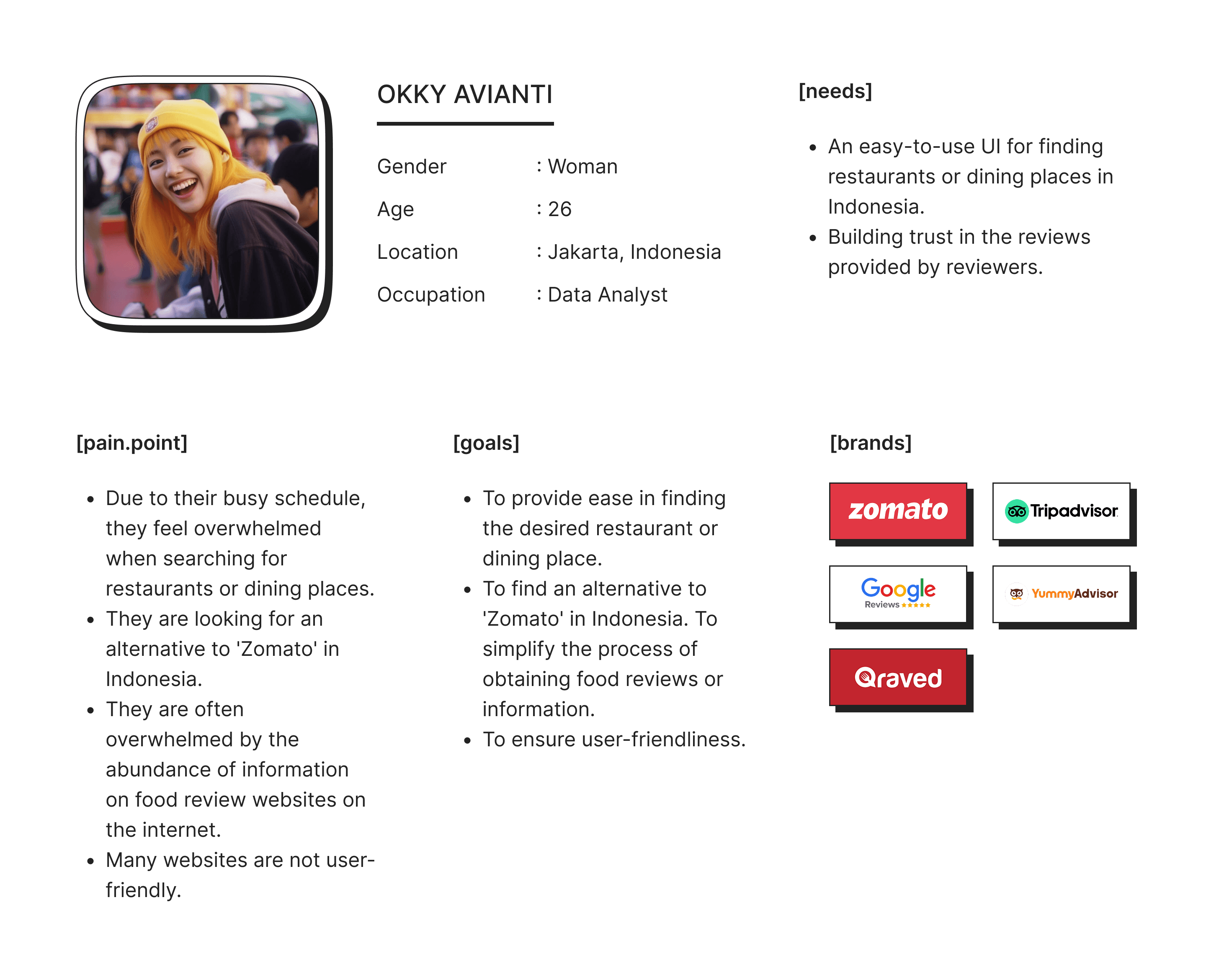
OKKY AVIANTI
Gender
Age
Location
Occupation
: Woman
: 26
: Jakarta, Indonesia
: Data Analyst
[needs]
An easy-to-use UI for finding restaurants or dining places in Indonesia.
Building trust in the reviews provided by reviewers.
[pain.point]
Due to their busy schedule, they feel overwhelmed when searching for restaurants or dining places.
They are looking for an alternative to 'Zomato' in Indonesia.
They are often overwhelmed by the abundance of information on food review websites on the internet.
Many websites are not user-friendly.
[goals]
To provide ease in finding the desired restaurant or dining place.
To find an alternative to 'Zomato' in Indonesia. To simplify the process of obtaining food reviews or information.
To ensure user-friendliness.
[brands]


[design.style]
[design.style]
Design style in UI/UX refers to the visual presentation and aesthetic decisions made in the interface of a digital product. These choices, which can include flat design, material design, minimalism, and various others, have a significant influence on the user experience and the product's brand identity.
Design style in UI/UX refers to the visual presentation and aesthetic decisions made in the interface of a digital product. These choices, which can include flat design, material design, minimalism, and various others, have a significant influence on the user experience and the product's brand identity.
STYLE GUIDE
STYLE GUIDE
Color Pallete
Primary
#E85250
#FF8D8C
Accent
#FFB25E
#E85250
#1C9152
#0A7AFF
Greyscale
#222222
#585858
#989898
#C4C4C
#F2F2F2
Typography
[Poppins]
Aa
32 Bold
Aa
24 Bold
Aa
24 Black
Aa
20 Bold
Aa
16 Medium
Aa
14 Regular
brown fox
jumps over
the lazy dog
[Inter]
Aa
16 Light
brown fox
jumps over
the lazy dog
Color Pallete
Primary
#E85250
#FF8D8C
Accent
#FFB25E
#E85250
#1C9152
#0A7AFF
Greyscale
#585858
#989898
#C4C4C
#F2F2F2
#222222
Typography
[Poppins]
Aa
32 Bold
Aa
24 Bold
Aa
24 Black
Aa
20 Bold
Aa
16 Medium
Aa
14 Regular
brown fox
jumps over
the lazy dog
[Inter]
Aa
16 Light
brown fox
jumps over
the lazy dog
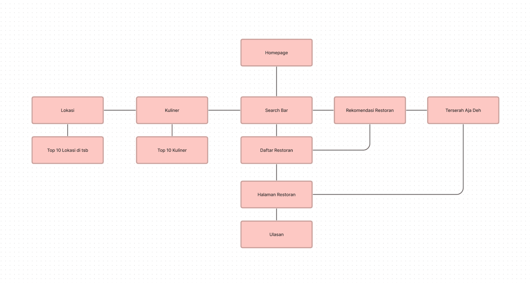
[wireframe.&.information.architecture]
[wireframe.&.information.architecture]
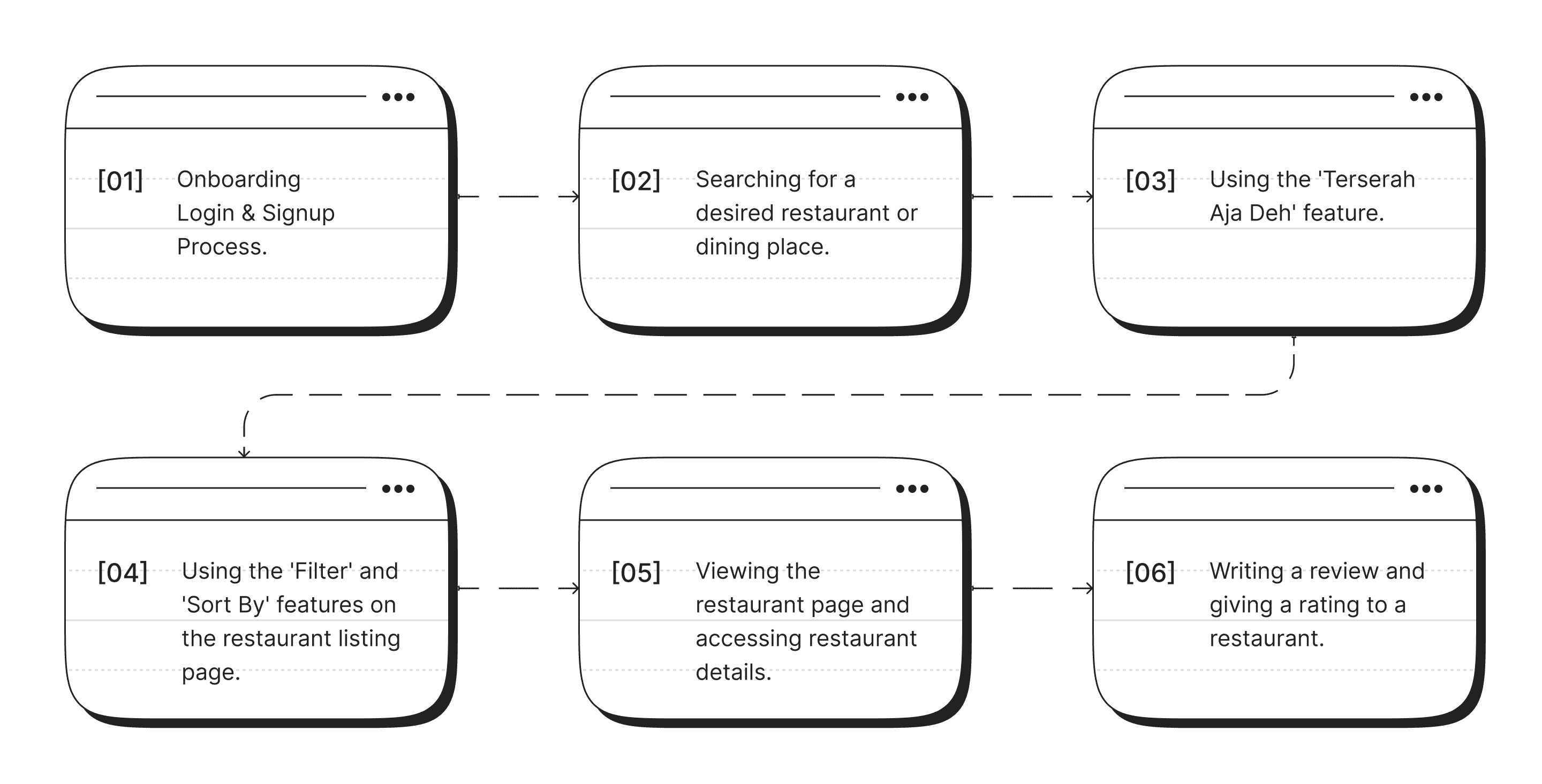
A user flow directs users through a process, encompassing their actions and choices to create an intuitive user experience. A sitemap provides a visual representation of the product's structure, assisting with content organization and navigation. It serves as the basis for creating wireframes and facilitates communication among stakeholders.
A user flow directs users through a process, encompassing their actions and choices to create an intuitive user experience. A sitemap provides a visual representation of the product's structure, assisting with content organization and navigation. It serves as the basis for creating wireframes and facilitates communication among stakeholders.
[site.map]
[wireframe]
[user.flow]

[site.map]
[wireframe]
[user.flow]
[ui.solutions]
[ui.solutions]
To resolve the problem of limited information visibility on the current website, I have created a new website that prioritizes improved readability. Through strategic categorization and hierarchical organization of content, users can readily access and comprehend the information. Furthermore, each page features clear and fitting calls to action to ensure the best possible user engagement.
To resolve the problem of limited information visibility on the current website, I have created a new website that prioritizes improved readability. Through strategic categorization and hierarchical organization of content, users can readily access and comprehend the information. Furthermore, each page features clear and fitting calls to action to ensure the best possible user engagement.
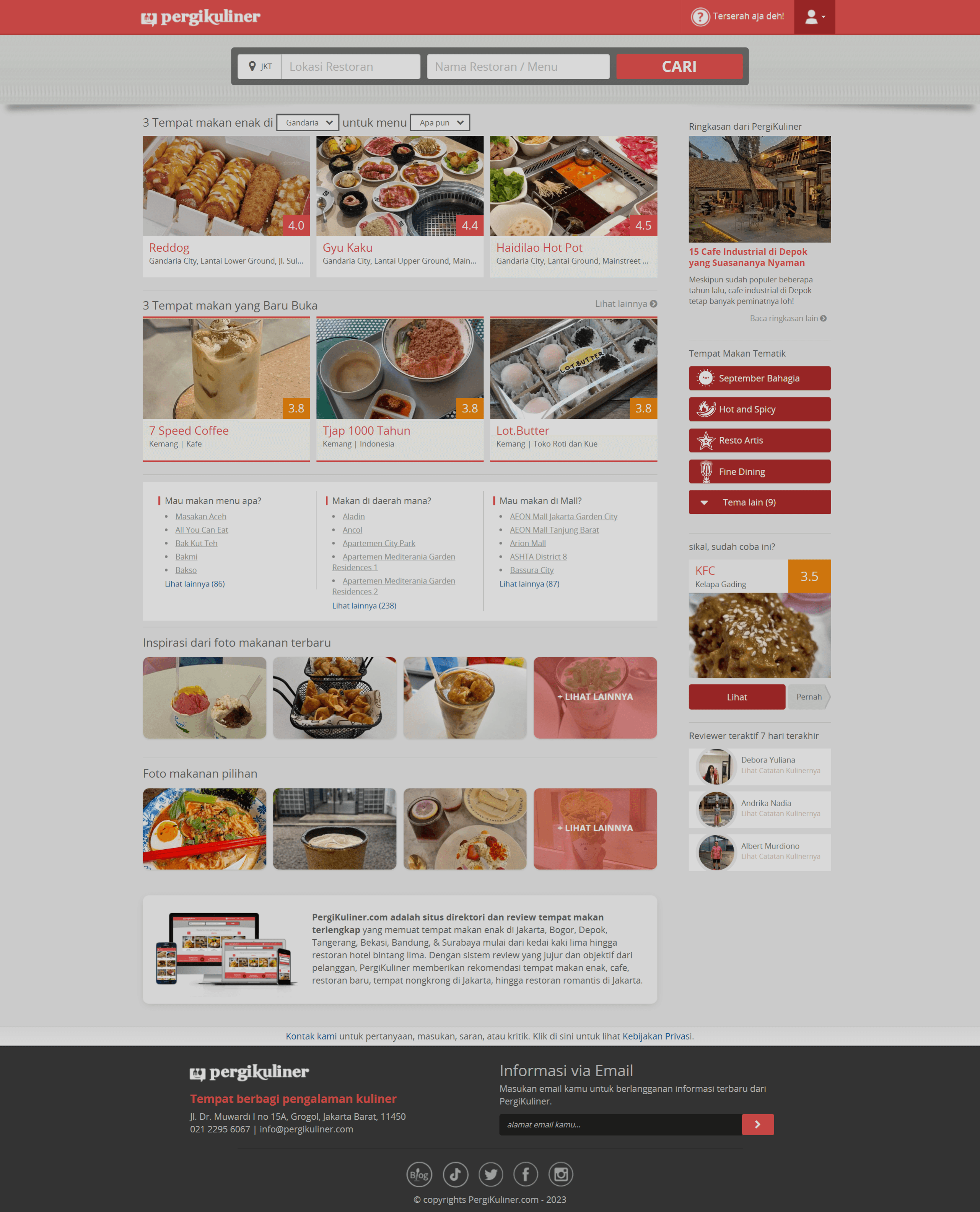
DESKTOP DESIGN
DESKTOP DESIGN
[01]
Creating an Overall Homepage/Landing Page Layout for Easy Understanding.
[before]
[after]
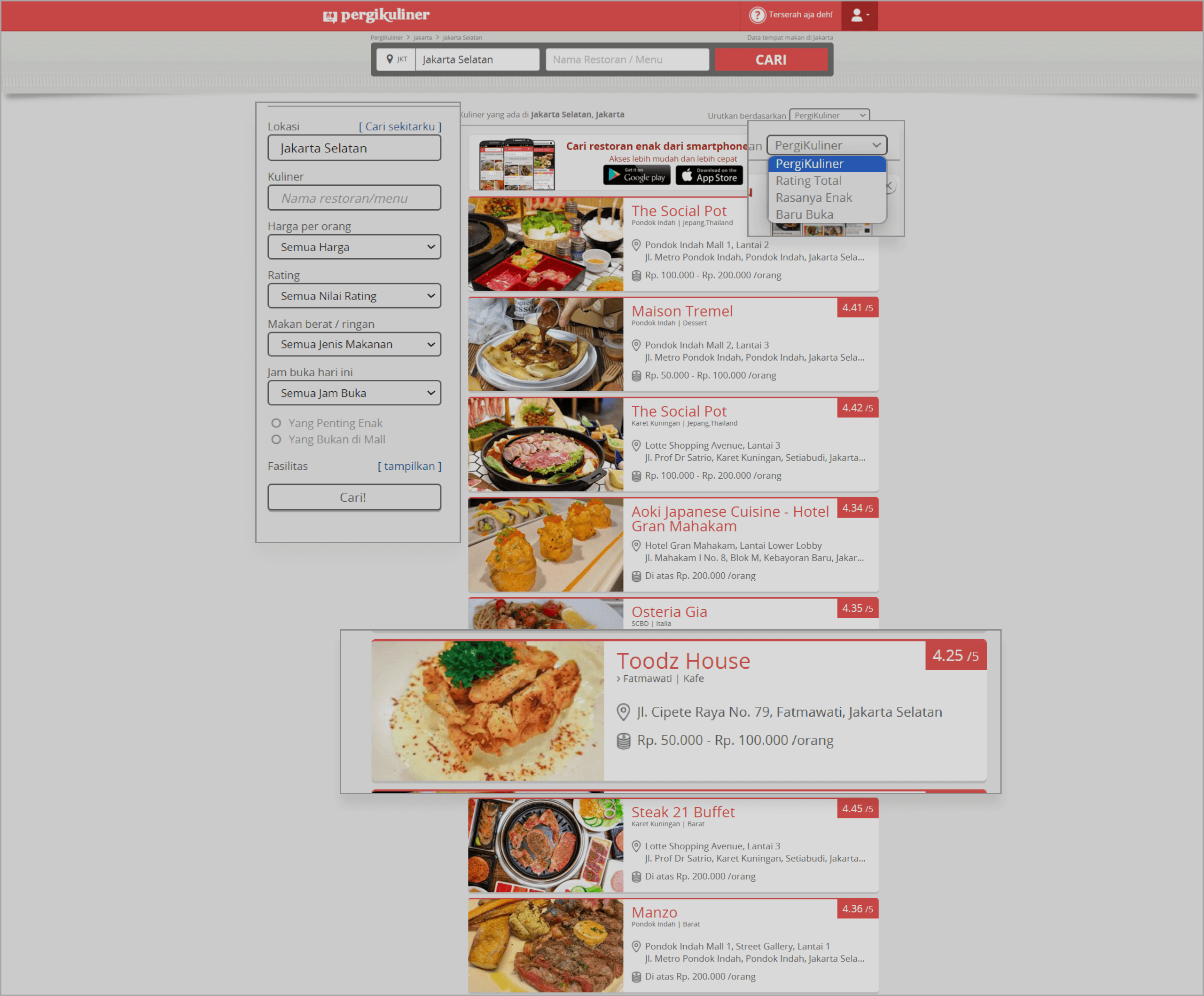
[02]
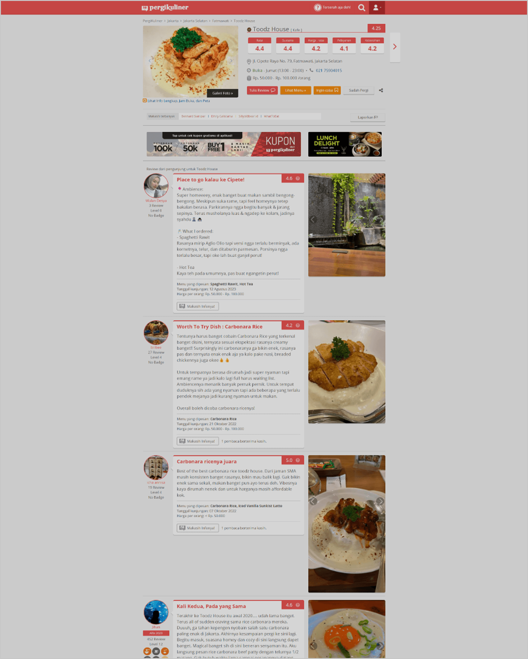
Making the Information Displayed Clearer and More Detailed on the "Restaurant List" or "Dining Places List" Page.
1
Improving Information on the Restaurant List Page – Enhancing the clarity and accuracy of restaurant details for better user experience.
2
Updating Information in the "Filter" and "Sort By" Features – Refining filtering and sorting options to help users find restaurants more easily.
3
Adding Time Information to Restaurant "Cards" – Displaying operational hours or peak times directly on the restaurant cards for quick reference.
4
Adding the "Open in Maps" Feature – Allowing users to quickly access location directions by integrating a direct link to maps.
[before]
[after]
[03]
Making the Information Displayed Clearer and More Detailed on the "Restaurant" or "Dining Place" Page.
1
Redesigning the Restaurant Detail Information Display – Enhancing the layout and readability of restaurant details for a better user experience.
2
Effortless Assignee Adjustments – Reassign tickets seamlessly for better teamwork.
3
Intuitive Progress Tracking – Stay updated on ticket status in real time.
4
Clarifying the Reviewer Rating System – Making the rating system more visible and easy to understand.
[before]
[after]
[04]
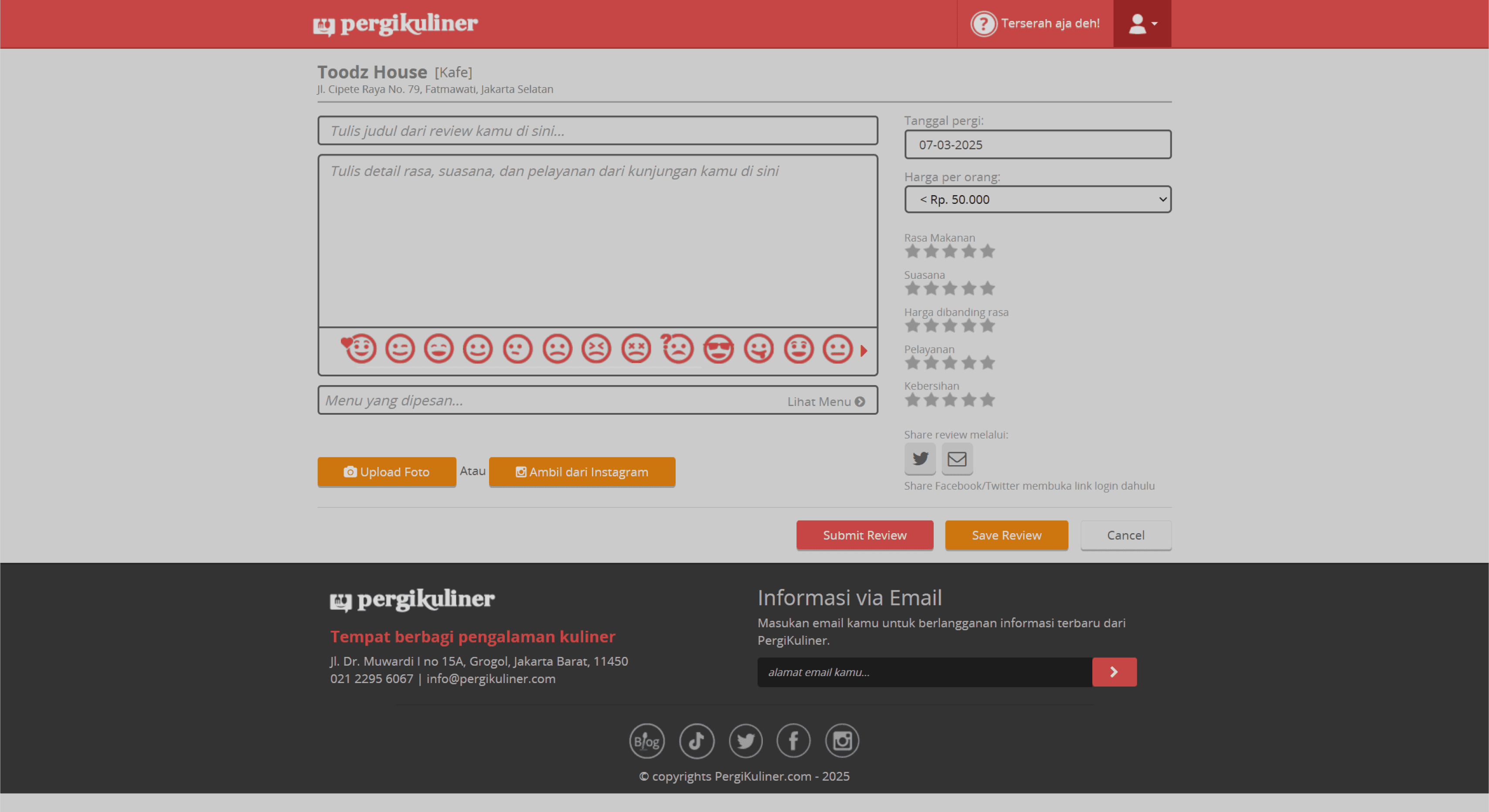
Making It Easier to Upload Reviews for Restaurants or Dining Places.
[before]
[after]
[01]
Creating an Overall Homepage/Landing Page Layout for Easy Understanding.
[before]
[after]
[02]
Making the Information Displayed Clearer and More Detailed on the "Restaurant List" or "Dining Places List" Page.
1
Improving Information on the Restaurant List Page – Enhancing the clarity and accuracy of restaurant details for better user experience.
2
Updating Information in the "Filter" and "Sort By" Features – Refining filtering and sorting options to help users find restaurants more easily.
3
Adding Time Information to Restaurant "Cards" – Displaying operational hours or peak times directly on the restaurant cards for quick reference.
4
Adding the "Open in Maps" Feature – Allowing users to quickly access location directions by integrating a direct link to maps.
[before]
[after]
[03]
Making the Information Displayed Clearer and More Detailed on the "Restaurant" or "Dining Place" Page.
1
Redesigning the Restaurant Detail Information Display – Enhancing the layout and readability of restaurant details for a better user experience.
2
Effortless Assignee Adjustments – Reassign tickets seamlessly for better teamwork.
3
Intuitive Progress Tracking – Stay updated on ticket status in real time.
4
Clarifying the Reviewer Rating System – Making the rating system more visible and easy to understand.
[before]
[after]
[04]
Making It Easier to Upload Reviews for Restaurants or Dining Places.
[before]
[after]
MOBILE DESIGN
MOBILE DESIGN
[01]
HOMEPAGE


[02]
LIST RESTAURANT


[03]
PAGE RESTAURANT


[04]
REVIEW PAGE


[01]
HOMEPAGE
[02]
LIST RESTAURANT
[03]
PAGE RESTAURANT
[04]
REVIEW PAGE
[01]
HOMEPAGE
[02]
LIST RESTAURANT
[03]
PAGE RESTAURANT
[04]
REVIEW PAGE
[01]
HOMEPAGE
[02]
LIST RESTAURANT
[03]
PAGE RESTAURANT
[04]
REVIEW PAGE
[01]
HOMEPAGE
[02]
LIST RESTAURANT
[03]
PAGE RESTAURANT
[04]
REVIEW PAGE


04.
04.
Conduct Usability Testing
Conduct Usability Testing
[type]
Unmoderated
[duration]
10-15 minutes
[participant]
5 Users
[tools]
[testing.remotely]
[testing.remotely]
Six tasks have been created to assess whether users can effectively complete them, and the results will help determine the user-friendliness of the application.
Six tasks have been created to assess whether users can effectively complete them, and the results will help determine the user-friendliness of the application.
[task]
[1st.result]
[2nd.result]
[task]
[1st.result]
[2nd.result]
[summary.&.conclusion]
[summary.&.conclusion]
Based on the results of the usability testing I conducted, I have successfully achieved an average success rate of 95%. These results indicate that the design I have created effectively addresses user issues. Out of the 8 tasks that were tested, four of them, namely the first, second, third, and fourth tasks, were completed perfectly by the users.
However, in the fifth, sixth, and seventh tasks, which involved finding real-time alerts or notifications, some users encountered difficulties in completing these tasks. I have identified areas that require improvement in my design to enhance the user experience when dealing with these specific tasks.
In conclusion, the results of the usability testing confirm that my design has been successful in most cases, but there is room for improvement to help users overcome challenges they may face in certain tasks. I am committed to continuously improving my design to provide the best possible user experience.
[type]
Unmoderated
[duration]
10-15 minutes
[participant]
5 User
[tools]
THANK YOU!
and hope to hear from you soon.
THANK YOU!
and hope to hear from you soon.


